


Time Frame
Role
Industry
Therapy
B2C
Ux Designer
3 Months
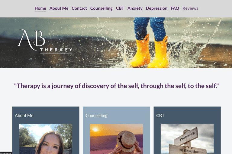
The original AB Therapy site (www.abtherapy.co.uk) had slow load times, a rigid layout, and poor mobile optimization. I redesigned it as www.abtherapy.online to create a seamless, modern experience aligned with how clients find therapy today. This case study covers my UX research, design choices, and business impact.
Information Architecture & Navigation
I reorganized content to match user expectations:
Simplified Top‑Level Menu: Reduced to Home, About, Services, Therapists, FAQ, Contact. This aligns with feedback
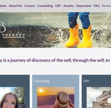
Sticky Header: Keeps navigation within thumb reach; includes a persistent "Book Free Consult" button.
Through surface UX research and iterative testing, I successfully transformed AB Therapy’s online presence into a modern, user-cantered platform. Engaging directly with Aideen and truly listening to her needs enabled me to design a website that is not only visually compelling but also highly functional, trustworthy and effective in driving engagement and bookings. In future projects, I aim to conduct even more in-depth research, develop additional prototypes and implement more rounds of iteration before development to ensure an even more refined and impactful user experience


ABOUT PROJECT |
PROCESS |
IDEATION |
During ideation, I aligned design concepts with the needs of key stakeholders:
Therapist (Aideen): required an intuitive way to update her profile and content.
Prospective clients: needed quick, mobile access to services and booking options.
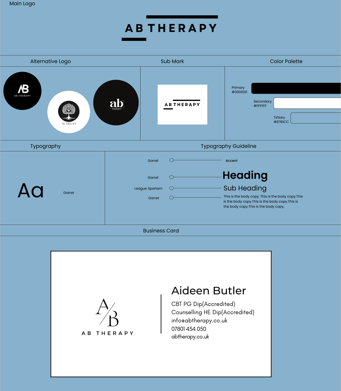
I started with a rebrand, redesigning the business logo, colors and font style. I focused on a mobile-first responsive layout, consistent visual branding to build trust, and performance optimization to achieve sub-3-second global load times.
RESEARCH |
UX Research Approach
To ensure the redesign met real user needs, I combined qualitative and quantitative methods:
Stakeholder Interview: I spoke with Aideen, the therapist, who highlighted difficulties managing content and the need for a clearer therapist presentation.
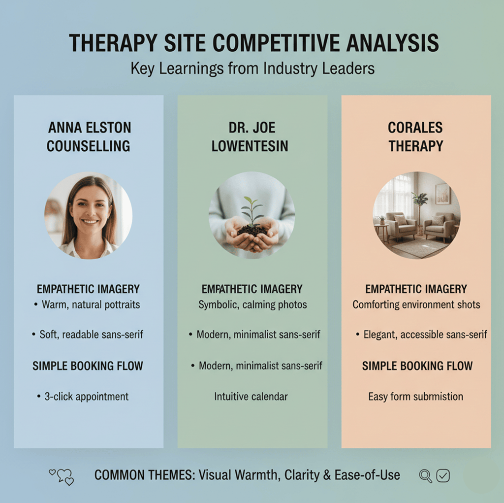
Competitive Analysis: I examined three leading therapy sites—Anna Elston Counselling, Dr. Joe Lowenstein, and Coralestherapy noting their empathetic imagery, clean typography and simple booking flows
PLANNING |
I decided on a brand identity after many rejected suggestions to the business owner. She gave me keywords, described her brand and that was my guideline. Also, from this research, I identified three guiding insights:
Mobile usability is paramount. Users on the go need a fast, thumb‑friendly interface.
Trust is built through transparency. Clear intuitive navigation coupled with clean aesthetics
Simplified journeys increase conversions. Every extra tap reduces the chance of booking.
Building on research insights, I framed five design goals:
Mobile‑First & Responsive: Use a fluid grid
Clear Visual Hierarchy: Employ a 1.25 modular type scale and consistent spacing (8px base unit).
Accessible & Inclusive: Achieve WCAG for text, color contrast, and keyboard navigation.
Brand Consistency: Use unified fonts, colors, and iconography to reinforce a reassuring tone.
High Performance: Leverage image optimization, and lazy loading to maintain <3s full‑load times
DESIGNING |
DEVELOPMENT |
OLD WEBSITE
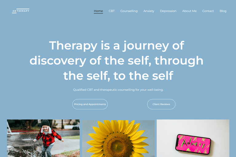
REDESIGN
OLD HOMEPAGE
NEW HOMEPAGE
TESTING |
With her help, we got some of her clients to test the new website, their feedback was helpful. They noted the ease of use and the overall look and feel of the website
LAUNCH |